Just about to watch Objectified as recommended by my housemate and have to say from what i have seen from Gary Hustwit's website it looks to be rather interesting. I have already seen his other documentary: Helvetica, and despite being a whole documentary about a font, it was actually rather interesting!
Inspirations
A collection of inspiring interiors and useful products.
Dieter Rams
Tonight i watched the culture show on BBC2 and in it was a short feature on the work of Dieter Rams, i found this to be extremely interesting so much so that i have decided to look into his product design and his 10 Commandments of Good Design, and i have to say that i did find these to be very useful, although intended for product design, they can be reapplied to any form of design.
I find his minimal and timeless take on product design fascinating. Less really is more!
I find his minimal and timeless take on product design fascinating. Less really is more!
Cold Cathode Lighting
I believe that cold cathode lighting would probably be the best choice to put in the light fittings in the office, along with halogen lamps to provide stronger light, the combination of the two could create an interesting effect.
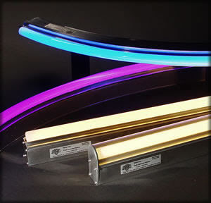

Cold cathode lights have a longer life than fluorescent tubes making them more desirable for maintenance-free long-life applications. They also do not contain mercury vapour which makes them
easier to dispose of and more environmentally friendly.

The colour used would be pure white, to create artificial lighting as close to natural light as possible.
Daylight Lamps could also be used for on desk application.

Cool Hunter.net
I have been browsing through www.thecoolhunter.net on the advise of the visiting lecturers and found some pretty cool office designs. So here they are.
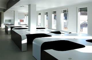
Modular desking system - Syzygy Agency by eins:eins Achitecten
Tighe Architectures futuristic design for The Moving Picture Company. Very minimal use of colour, i like the way that the lights are integrated into walls.
Small Offices Book
I took out a book from the library entitled Small Offices by evergreen.
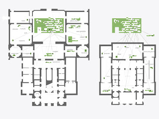
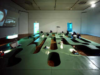
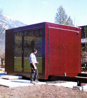
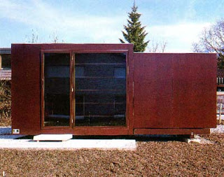
Here are some designs that i found fairly inspirational to my design.
The Bartle Bogle Hegarty office in japan by Klien Dytham is in some ways similar
my curved rectilinear forms (although cut in half).
I particularly like the white lacquered finish.
The way the conference table is made in this very interesting and reflects on japanese culture due to the unusual seating arrangement.
Sadly this interesting little office was shut in 2008 as it was only temporary in nature.

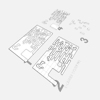
Another office of interest was Fast Forward by Propeller Z due to its modular nature and the way it plays with positive and negative forms. All the parts of the fittings come from one rectangular box with shapes cut out of it, the shapes are then repositioned in other rooms with the main shape being left as the main office arrangement. It is very minimal yet stylish.


The last office of interest was called Fred. Fred was made by Oskar Leo Kaufmann.
It is a small single unit office that is expandable. it measures 10ft x 10ft x 10ft when closed
and extends up to 710ft. It does this through the use of rails.
It is easy to transport and relocate and just needs to be hooked up to the facilities when in place.
Furnishings are built in.


Mobile Powered Systems
For the modular desks that can be moved around the floor on tracks like library shelving units
Modular units can be powered using a track that supplies power to the units much like

they would need to be powered somehow, this would be an appropriate solution!
Modular units can be powered using a track that supplies power to the units much like
these library shelving systems.

PowerTrack™ ground embedded wiring | |
(Patent No.: 6,845,721) Building on its innovative capabilities, the WIRED™'s new PowerTrack™ was developed to optimize space conservation by concealing the power wiring in the floor tracks, thus eliminating dangling scissor arms or pantographs between the mobile units. The new PowerTracks™ |
Tokyo
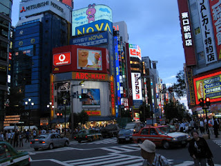
Tokyo, as a city is very vibrant with an awful lot of signage and buildings in a very small space, i'd like to perhaps take this idea of putting alot (perhaps modules) into the office space to make the most efficient use of the space, while making each module unique and separate from each other to create a vibrant and inspiring office space.


Subscribe to:
Comments (Atom)


