Just about to watch Objectified as recommended by my housemate and have to say from what i have seen from Gary Hustwit's website it looks to be rather interesting. I have already seen his other documentary: Helvetica, and despite being a whole documentary about a font, it was actually rather interesting!
A collection of inspiring interiors and useful products.
Dieter Rams
Tonight i watched the culture show on BBC2 and in it was a short feature on the work of Dieter Rams, i found this to be extremely interesting so much so that i have decided to look into his product design and his 10 Commandments of Good Design, and i have to say that i did find these to be very useful, although intended for product design, they can be reapplied to any form of design.
I find his minimal and timeless take on product design fascinating. Less really is more!
I find his minimal and timeless take on product design fascinating. Less really is more!
Cold Cathode Lighting
I believe that cold cathode lighting would probably be the best choice to put in the light fittings in the office, along with halogen lamps to provide stronger light, the combination of the two could create an interesting effect.
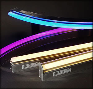

Cold cathode lights have a longer life than fluorescent tubes making them more desirable for maintenance-free long-life applications. They also do not contain mercury vapour which makes them
easier to dispose of and more environmentally friendly.

The colour used would be pure white, to create artificial lighting as close to natural light as possible.
Daylight Lamps could also be used for on desk application.

Cool Hunter.net
I have been browsing through www.thecoolhunter.net on the advise of the visiting lecturers and found some pretty cool office designs. So here they are.
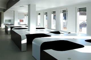
Modular desking system - Syzygy Agency by eins:eins Achitecten
Tighe Architectures futuristic design for The Moving Picture Company. Very minimal use of colour, i like the way that the lights are integrated into walls.
Small Offices Book
I took out a book from the library entitled Small Offices by evergreen.
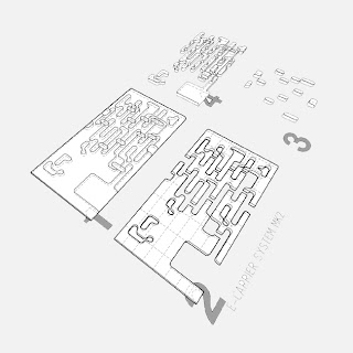
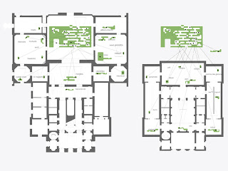
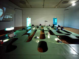
Here are some designs that i found fairly inspirational to my design.
The Bartle Bogle Hegarty office in japan by Klien Dytham is in some ways similar
my curved rectilinear forms (although cut in half).
I particularly like the white lacquered finish.
The way the conference table is made in this very interesting and reflects on japanese culture due to the unusual seating arrangement.
Sadly this interesting little office was shut in 2008 as it was only temporary in nature.

Another office of interest was Fast Forward by Propeller Z due to its modular nature and the way it plays with positive and negative forms. All the parts of the fittings come from one rectangular box with shapes cut out of it, the shapes are then repositioned in other rooms with the main shape being left as the main office arrangement. It is very minimal yet stylish.


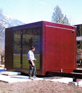
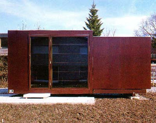
The last office of interest was called Fred. Fred was made by Oskar Leo Kaufmann.
It is a small single unit office that is expandable. it measures 10ft x 10ft x 10ft when closed
and extends up to 710ft. It does this through the use of rails.
It is easy to transport and relocate and just needs to be hooked up to the facilities when in place.
Furnishings are built in.


Mobile Powered Systems
For the modular desks that can be moved around the floor on tracks like library shelving units
Modular units can be powered using a track that supplies power to the units much like

they would need to be powered somehow, this would be an appropriate solution!
Modular units can be powered using a track that supplies power to the units much like
these library shelving systems.

PowerTrack™ ground embedded wiring | |
(Patent No.: 6,845,721) Building on its innovative capabilities, the WIRED™'s new PowerTrack™ was developed to optimize space conservation by concealing the power wiring in the floor tracks, thus eliminating dangling scissor arms or pantographs between the mobile units. The new PowerTracks™ |
Tokyo
Tokyo, as a city is very vibrant with an awful lot of signage and buildings in a very small space, i'd like to perhaps take this idea of putting alot (perhaps modules) into the office space to make the most efficient use of the space, while making each module unique and separate from each other to create a vibrant and inspiring office space.
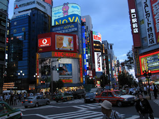


Inspirational images
I have been researching communities for the GIDE design project to find some sort of basis for my design and came across the ideas of utopia and dystopia, now dystopian architecture is very prominant in films and computer games, such as Blade Runners Los Angeles, Akiras Neo Tokyo and Half Life 2's City 17, so i decided to start by looking at these to get some inspiration for the office concept drawings.
As you can see, these bleak city scapes are actually brimming with life and a sense of community, albiet a dystopian one, the authority or situation actually causes these people to band together creating a lively cityscape with lots of intricate detail (thanks mainly to film makers and game designers). The apartment in Bladerunner is actually based on Frank Lloyd Wrights
"Ennis House" which gives it an anchor to reality compared to some of the more futuristic skyscrapers. Half-lifes City 17 has a very distinct eastern european feel to it, again under the oppression from an authority based in the large, towering skyscraper in the center of the city. (possibly based on the ziggurat from metropolis?)
I will also be looking into Utopian architecture as part of the positive / negative concept.
Clive Wilkinson Architects
Clive Wilkinson Architects
Interesting Artical on Creative Office Spaces
16/04/08
10 annoyingly brilliant office interiors
in an ideal world all company directors would invest in their workforce to the point where the office didn’t resemble a huge ice cube filled with back-breaking plastic chairs, mdf tables and computers less powerful than my old commodore plus-4. the sad fact is, for the majority of the world’s office-dwelling workers at least, company offices are some of the most inhospitable places on earth.so, with depression now approaching, it seems like the perfect opportunity to point out some workplaces where a lucky few experience an emotion other than dread as they walk past reception every morning, to be greeted with an office interior which has actually been designed by someone possessing more creativity than a gnat.
1. pixar - designed by bohlin cywinski jackson
for the pixar staff to work in a space anything other than brilliant would’ve been an immense shock. i can’t imagine the team churning out films like the incredibles whilst sitting on a collapsable plastic chair, colleagues fighting over the only pritt-stick in the room. the staff don’t have normal cubicles to work in, rather wooden cabins full of comfortable furniture and gentle lighting. the whole place looks extremely comfortable and, more importantly, productive.
2. red bull - designed by jump studios
ironically, the red bull headquarters’ offices resemble a workspace designed by a human recently injected in the spine with the energy drink. everything about this place is shiny, smooth, angular and slightly manic and there’s even an effort-negating slide connecting floors for the lazy bastards who forgot to drink their regulation can of the good stuff in the morning.
3. google zurich
anyone who’s been plugged into the intertubes in the past few years will probably have seen the google offices already. the photos above are of the zurich office, surely the most non-productive workplace on earth. they’ve got slides, ballpools, countless pool tables, relaxation pods, a fireman’s pole… all to please people who are already getting paid an obscene amount of money just to turn up and work for one the most powerful companies on earth.
4. tbwa - designed by klein dytham
at first glance the tbw office in downtown tokyo looks more like a recreational park with a roof. look a little harder though and beyond the grass and beautiful wooden seating areas are staff, apparently hard at work. unless your colleagues were a complete pain in the arse it would be difficult not to at least slightly enjoy your time here and it’s a credit to the design firm, klein dytham.
5. pallotta teamworks - designed by clive wilkinson architects
pallotta teamworks’ headquarters can be found in los angeles inside what must be the world’s most homely warehouse. due to budget constraints all the offices and workhouses have been constructed using recycled materials, the majority of the staff’s offices housed inside old shipping containers. it could’ve looked awful but an intelligent colour scheme and a lot of imagination have made this easily one of the world’s most intriguing offices.
6. threadless
i’m not sure who was responsible for the design of the threadless office but, judging by the brilliance of the product they sell, i wouldn’t be surprised if the staff themselves did. the place looks like it’s been this office for decades: worn in but incredibly ‘hip’. walls and furniture are covered in graffiti, high ceilings somehow result in a cosier environment and no staff member can be seen to possess less than 2 widescreen monitors at their desk.
7. ilse media - designed by wat design
the staff at ilse media like pixels. massive pixels. the interior of their office is covered in huge pixelated pictures - an ice-cream truck in the cafe, a mail-van by the toilets and telephone booths in the main office - to the point where the table cloth is home to pixelated dinner plates holding pixelated food. the icing on the blocky cake would surely be a zx spectrum at every worker’s desk.
8. danone waters - designed by klein dytham
the last thing you want to be surrounded by while you’re at the office is thousands of the products you’ve been paid to create / sell and subsequently have nightmares about. however, the klein dytham designed danone waters office in tokyo is excused due to the fact that the use of the product actually serves a purpose: to divide the rooms into workspaces. thousands of empty plastic bottles have been arranged into dividing walls and it looks pretty good, if not slightly fragile.
9. three rings - designed by because we can
according to their website, three rings are responsible for developing ‘persistent world online games’. more importantly, their staff work in what i believe to be both the coolest office on earth and one of the very few steam-punk workplaces in existence. there’s too much to mention for a man as lazy as myself so go to the designers’ website here to read more info and stare at more photos, including one of a (not very) secret door which leads to an equally secret lounge.
10. mother, london - designed by clive wilkinson architects
advertising agency mother enlisted clive wilkinson architects to design their cubicle-less shoreditch offices and the result is incredible. one continuous 240ft long concrete table, which the designers claim is ‘probably the largest table in the world’, sweeps through the building and can seat up to 200 staff, all of whom are encouraged to sit at different locations every 4 weeks to shake things up a bit.
GIDE Project
For the Gide international project, i have visited SHINE, a creative office in harehills, Leeds. We will be using part of the top floor of this building to create an office for creative ad company Mother.
The design for the current london office for Mother is quite frankly brilliant, especially the feature table that blurs the line between floor, table and stairs which is the work of Clive Wilkinson Architects.
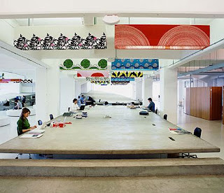
Mother office in London
Links
SHINE website
Mother London
Mother New York
Clive Wilkinson Architects
The design for the current london office for Mother is quite frankly brilliant, especially the feature table that blurs the line between floor, table and stairs which is the work of Clive Wilkinson Architects.

Mother office in London
Links
SHINE website
Mother London
Mother New York
Clive Wilkinson Architects
Subscribe to:
Comments (Atom)


